Increasing task success for medication alerts by 66%
Increasing task success for medication alerts by 66%


UX Designer
CarePlanner (now nourish): A UK B2B SaaS helping 2000+ care agencies deliver domicillary care
Problems
CarePlanner's eMARS feature had been in beta for some time by 2019, with early engagement from care providers but limited depth of adoption. Two core issues threatened its commercial viability:
Perceived Complexity: Sales teams avoided demoing the alerts feature, describing it as overwhelming for customers already managing the administrative burden of digital medication records for the first time.
No Baseline Data: A lack of product analytics made it impossible to quantify adoption, diagnose the root cause of disengagement, or build a business case for improvement.
Cost of Inaction
Patient Safety: Users who found the alerts too complex avoided the feature entirely. Those who attempted setup risked misconfiguring alerts without realising, creating a false sense of security, which could mean misunderstandings of actual medication outcomes and failure to intervene when it mattered most.
Commercial risk: With eMARS in extended beta and competitive pressure mounting, continued underperformance of the alerts feature risked undermining confidence in the broader product and delaying full commercial release.
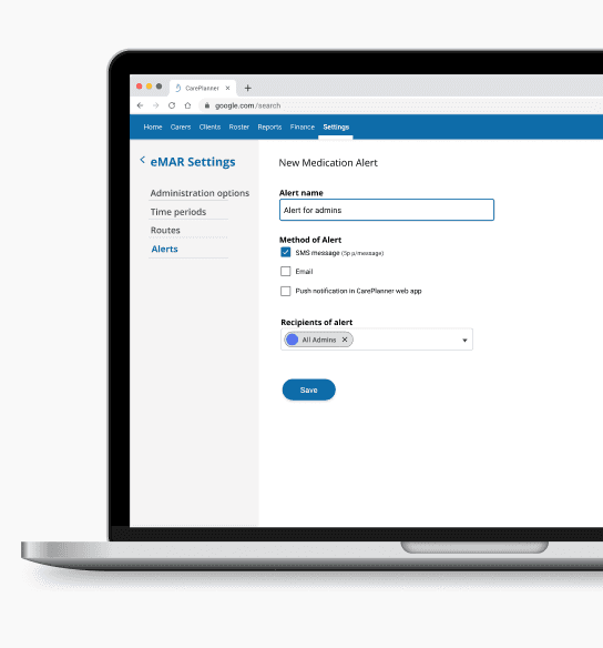
Solution
I redesigned the medication alerts journey, separating alert creation from the medication record form into two distinct tasks. This reduced cognitive load, removed confusing terminology, and introduced reusable alert defaults.
Solution
I redesigned the medication alerts journey, separating alert creation from the medication record form into two distinct tasks. This reduced cognitive load, removed confusing terminology, and introduced reusable alert defaults.
Impact
Impact
66% increase in task success
From: 17% - To: 83%
6.5 decrease user errors
From: avg. 7 p/session - To: avg. 0.5 p/session
01:19 mins saved to complete task
From: 03:03 mins - To: 02:44 mins
From: 03:03 mins - To: 00:24 mins
66% increase in task success
From: 17% - To: 83%
6.5 decrease user errors
From: avg. 7 p/session - To: avg. 0.5 p/session
01:19 mins saved to complete task
From: 03:03 mins - To: 00:24 mins
Research
'Too complex for me'…
I began by conducting 1:1 interviews with 6 care managers already using the eMARS beta, to understand their experience of the alerts feature firsthand. Three themes emerged consistently:
Despite having medication data on paper records, correctly entering medication records digitally was described as intense and time-consuming — alerts felt like an additional burden on top of an already demanding task.
All 6 participants were aware of the alerts feature and 4 had used it on occasion, but none had consistent alert coverage across their clients.
The perceived complexity of setup and lack of time were cited by every participant as the primary barriers to adoption.
To validate these findings, I designed an observation task asking each participant to demonstrate how they would set up an alert for a client refusing a specific medication. The results were stark.


“My sole focus is getting all the medication paperwork set up…it’s a lot of admin. It’s not just a quick fill-in-a-form job, this is people's medication records! The details have to be right… Alerts look a bit too complex for me to think about right now”
The Data Confirmed Our Fears.
Unfortunately, observations of users using the feature weren't any more encouraging. Using the same candidates from the interviews, I asked users to demonstrate how they would 'set up an alert to receive if a chosen client refused a specific medication'. I observed their interactions.
With such a low success rate, the observations indicated there was a clear disconnect between the user’s mental model and the user experience. The high error rate, coupled with the feedback from interviews, suggested that without intervention, users would continue to abandon or ignore the alerts feature.
With such a low success rate, the observations indicated there was a clear disconnect between the user’s mental model and the user experience. The high error rate, coupled with the feedback from interviews, suggested that without intervention, users would continue to abandon or ignore the alerts feature.
Unfortunately, observations of users using the feature weren't any more encouraging. Using the same candidates from the interviews, I asked users to demonstrate how they would 'set up an alert to receive if a chosen client refused a specific medication'. I observed their interactions.
With such a low success rate, the observations indicated there was a clear disconnect between the user’s mental model and the user experience. The high error rate, coupled with the feedback from interviews, suggested that without intervention, users would continue to abandon or ignore the alerts feature.

With only 1 of 6 users completing the task successfully — relying on a previously configured alert as a guide — a 17% success rate, an average of 7 errors per session, and a completion time of 03:03 minutes told a clear story: the existing design was failing users.
for setting up a new alert
for setting up a new alert
17% task success
17% success rate
1 user didn't attempt task at all.
for setting up a new alert
17% task success
1 user didn't attempt task at all.
07 user errors
07 user errors
made on average per session
made on average per session
07 user errors
made on average per session
03:03 mins to success
03:03 mins
For fastest and only user
to success for fastest and only user
03:03 mins to success
For fastest and only user
Define
Define
Measuring Success.
Presenting these findings to stakeholders made the case for intervention clear. With no product analytics available to establish a quantitative baseline, we anchored our success measures directly to the observation data, setting targets that would demonstrate a meaningful improvement in usability against the same tasks users had just failed.
01.
Increase task success
At least 5/6 (83%) users should be able to successfully create a medication alert in their first attempt.
At least 5/6 (83%) users should be able to successfully create a medication alert in their first attempt.
02.
Decrease user errors
Decrease user errors
Users should be able to create an alert making less than 5 errors (per session).
03.
Reduce time to success
Users should be able to create an alert within less than 2 minutes.
Ideation & Design
Design
Separating Complexity to Conquer It.
Drawing on Lean UX principles, I introduced a collaborative ideation workshop bringing together engineers and product owners to map the existing alert creation journey step by step. As the first UX hire in the business, establishing this kind of cross-functional working was as deliberate as the design work itself.
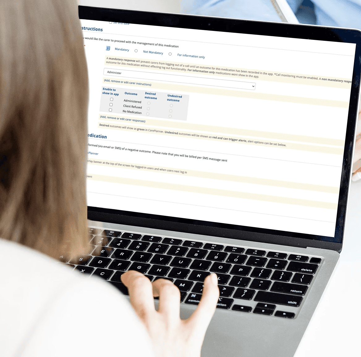
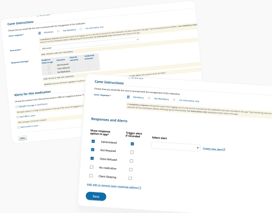
The workshop focused heavily on two key friction points identified in our research findings. The alerts feature sat at the bottom of an already lengthy medication record form, meaning users were cognitively fatigued before they reached it. The language in steps 4 and 5, which asked users to categorise responses as 'desired' or 'undesired', was also abstract and unreflective of natural language in a care context.
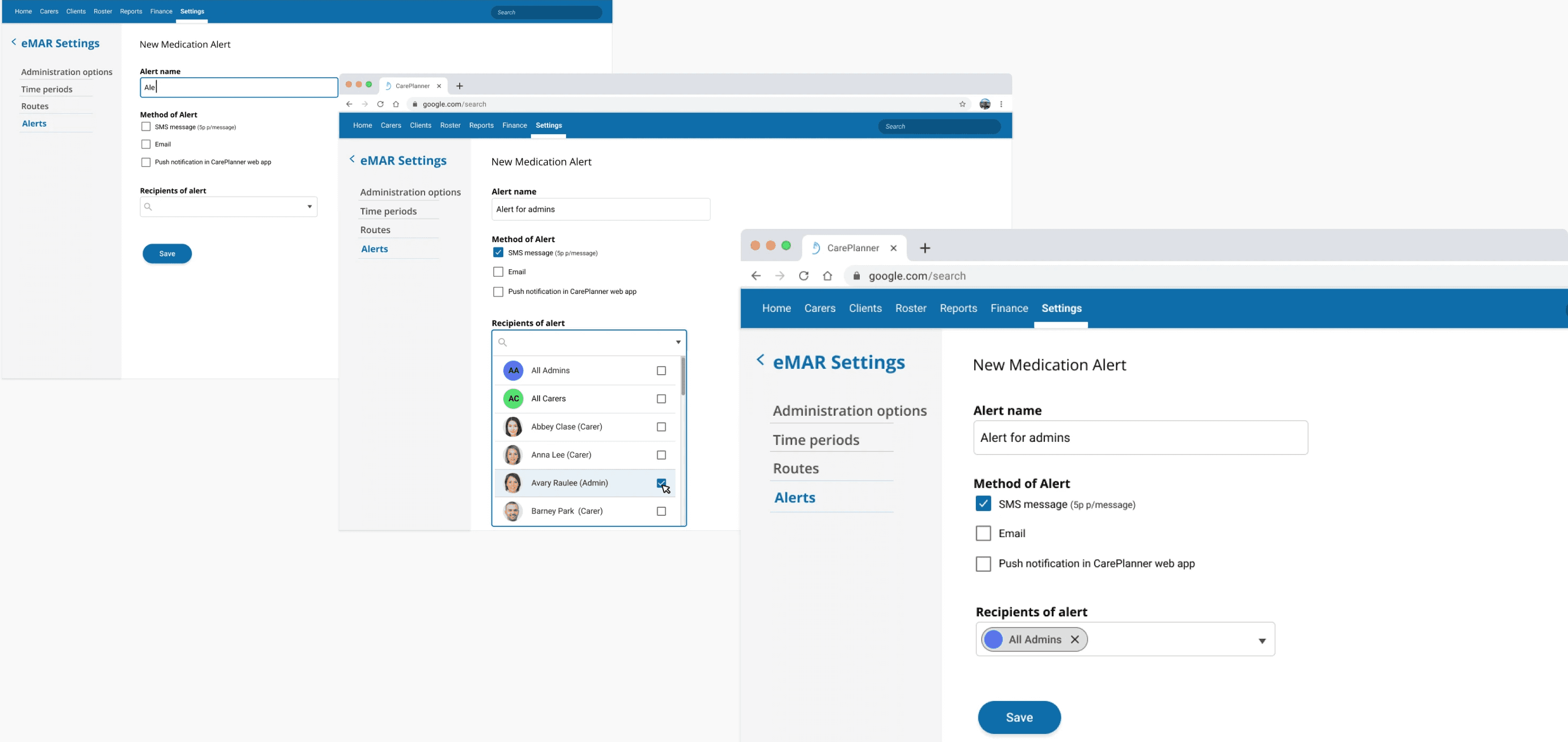
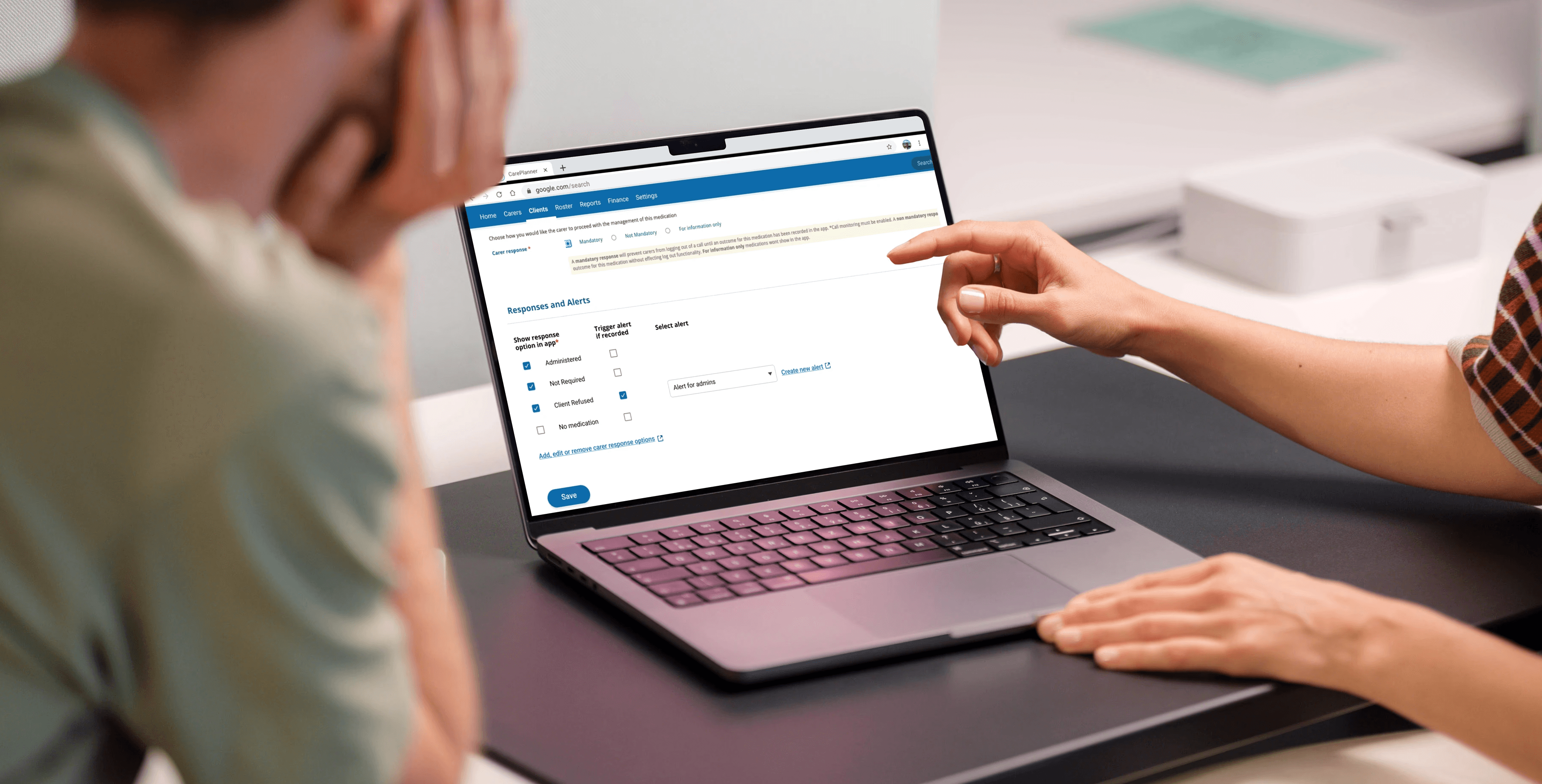
I wireframed a solution separating alert creation into two distinct tasks, moving setup into a dedicated settings page and allowing trigger conditions to be defined separately on the medication record. This removed the 'desired' and 'undesired' terminology entirely and significantly reduced cognitive load at each step.
Stakeholders were enthusiastic, particularly about the ability to create reusable alerts. However there were concerns whether a user would understand how to apply a previously created alert. To test this concern I developed a prototype and moved into usability testing to find out.


Test & Iterate
Test & Iterate
From 17% to 83%.
To test the redesign, I introduced remote usability testing to CarePlanner for the first time, building a click-through prototype in Marvel and running structured tests through Maze. Two tasks mirrored the original observation scenarios, allowing direct comparison against our baseline findings.
Task 1: In the new eMARS settings page create a medication alert to notify a chosen staff member of a medication issue, via your preferred method.
Result: 83% of testers completed task 1. Spending an average of 1.5 seconds on each step in the flow.
Result: 83% of testers completed task 1. Spending an average of 1.5 seconds on each step in the flow.
83% task success
83% task success
for setting up alerts across both screens
Increase from 17% in original designs
5 user errors
5 user errors
in total across all 12 testing sessions
From avg. of 7 per session in original designs
00:23 secs to success
00:23 secs to success
for fastest users
From 03:03 mins in original design
83% task success
for setting up alerts across both screens
Increase for 17% in original designs
5 user errors
in total across all 12 testing sessions
From avg. of 7 per session in original designs
00:23 secs to success
for fastest users
From 03:03 mins in original design
Task 2: Select a client you want to receive a medication alert about and set up a medication alert for when they refuse a specific medication.
Result: 83% of testers completed the task, spending an average of 2.7 seconds on each step. The fastest user correctly completed task 1 (create alert) and task 2 (apply alert) in 23 seconds.


The results validated the redesign against every measure of success we had set. Seeking further improvement, I reviewed the screen recordings in detail to identify remaining opportunities. In task 2, I noticed a 33% error rate around a single step , where 4 of 12 users missed the 'enable to show in-app' toggle. Although technical constraints prevented removing this step entirely, I proposed smart defaults based on the 3 most common alert configurations, identified through follow-up conversations with customers.
I also proposed adding a default in the ‘create an alert’ page, so users could immediately use the feature ‘out of the box’. This would help address the need of the 83% of users who were setting up the same alert to alert the same people time and time again.
Measure
Measure
'Much better for the way we work'.
Evaluated against the three measures of success defined at the outset, the redesign exceeded expectations across the board.
Task success reached 83% across both tasks, meaning 10 of 12 users could now successfully create and apply an alert end to end. Error rates fell from an average of 7 per session to just 5 in total across all 12 test sessions. And where the original design had taken the fastest user over 3 minutes, the new design saw users complete both tasks in under 24 seconds.
Perhaps most significantly, users who had previously avoided the feature entirely were now completing both tasks with confidence, suggesting that with the right design, the feature was far more accessible than users had ever believed.
+66% increase in task success
Original design: 17%
New design: 83%
+66% increase in task success
Original design: 17%
New design: 83%
-6.5 decrease in errors
Original design: 7 p/session
New design: 0.5 p/session
-6.5 decrease in errors
Original design: 7 p/session
New design: 0.5 p/session
+01:19 mins saved
Original design: 03:03 mins
New design: 01:44 mins
+01:19 mins saved
Original design: 03:03 mins
New design: 01:44 mins

+66% increase in task success
Original design: 17%
New design: 83%
-6.5 decrease in errors
Original design: 7 p/session
New design: 0.5 p/session
+01:19 mins saved
Original design: 03:03 mins
New design: 01:44 mins
“Being able to reuse the same alert multiple times is much better for me…and I can still customise and create one off alerts to account for those more trickier scenarios…this will be much better for how we work”
“Being able to reuse the same alert multiple times is much better for me…and I can still customise and create one off alerts to account for those more trickier scenarios…this will be much better for how we work”
“Being able to reuse the same alert multiple times is much better for me…and I can still customise and create one off alerts to account for those more trickier scenarios…this will be much better for how we work”
“Being able to reuse the same alert multiple times is much better for me…and I can still customise and create one off alerts to account for those more trickier scenarios…this will be much better for how we work”

Success sustained
Success sustained
Define
Business Impact.
Beyond the immediate usability gains, the redesign delivered broader value across the business:
From Avoided to Advocated: Sales teams who had once sidestepped the alerts feature began actively championing it, positioning it as shaped directly by the people who use it every day. The same usability evidence that rebuilt sales confidence also gave the business the assurance to launch eMARS to its full customer base in 2020, at the height of the COVID-19 pandemic, when reliability, usability and ease of adoption were critical.
Strategic Asset at Acquisition: In the years that followed, CarePlanner was acquired by Nourish Care, who lacked an eMARS capability of their own. A fully released, proven and usable eMARS feature represented significant strategic value.
Learnings.
Pioneering UX in a business that had never had it before sharpened skills I still rely on today:
Internal Confidence as a Barometer: One of the earliest signals that the alerts feature needed attention wasn't a user complaint, it was a sales team quietly avoiding it in demos. This project taught me that internal confidence in a feature is often a reliable reflection of its outward reception. I now make it a deliberate first step to assess perception across internal teams, sales, marketing and account managers, before looking outward to users.
Good Tools, Used Well, Travel With You: This project was the first time I dug deeply into Productboard to explore existing customer feedback, and the value of having a single consolidated source was immediately clear. It has become a tool I rely on to organise and analyse incoming feedback ever since, so much so that I introduced it at UCAS and built the frameworks to support it, later implementing Prodpad, a similar user insight repository, at Fruugo.
Learnings.
Pioneering UX in a business that had never had it before sharpened skills I still rely on today:
Internal Confidence as a Barometer: One of the earliest signals that the alerts feature needed attention wasn't a user complaint, it was a sales team quietly avoiding it in demos. This project taught me that internal confidence in a feature is often a reliable reflection of its outward reception. I now make it a deliberate first step to assess perception across internal teams, sales, marketing and account managers, before looking outward to users.
Good Tools Travel With You: This project was the first time I dug deeply into Productboard to explore existing customer feedback, and the value of having a single consolidated source was immediately clear. It has become a tool I rely on to organise and analyse incoming feedback ever since, so much so that I introduced it at UCAS and built the frameworks to support it, later implementing Prodpad, a similar user insight repository, at Fruugo.

