Growing download conversions by 362%

Growing download conversions by 362%

About Image
About Image
About Image
About Image

Product Designer

UCAS: UK's national Universities Admissions Service, serving 350+ Universities and 3M students

Problems


Following the acquisition of a scholarship app, UCAS launched 'Myriad' in 2022, a product suite designed to streamline international university admissions. Two critical blockers threatened its success:

  • Institutional Scepticism: Without the UCAS master brand, UK universities perceived Myriad as a risky startup rather than a core UCAS commitment. This sluggish institutional buy-in made recruitment agents equally hesitant, stalling the network effect the platform depended on.


  • Proposition Evolution and Inconsistency: Frequent iterations as the product pivoted from a scholarship-matching app to a full admissions platform resulted in fragmented messaging. This lack of a unified value proposition confused students and hindered conversion efforts and user retention.

Cost of Inaction


  • Inflated cost of acquisition: With three distinct audiences: students, recruitment agents, and UK universities, the new 'Myriad' brand required significant marketing and sales resource to manufacture brand authority from scratch.


  • Market Stagnation: Without action, Myriad would continue failing to convert students at the velocity needed to justify the original acquisition, conceding market share and compounding financial loss.

Solution


In partnership with external agency Hybrid, who led brand creative, I owned the product strategy and implementation — translating the new identity into conversion-focused experiences across three platforms in 30 days.

Solution


In partnership with external agency Hybrid, who led brand creative, I owned the product strategy and implementation — translating the new identity into conversion-focused experiences across three platforms in 30 days.

Impact

Impact

482% increase in App and Play store conversions

From: 8,000 - To: 46,580

From: 8,000 - To: 46,580

326% increase in sign ups after downloads

From: 7399 - To: 31,561

From: 7399 - To: 31,561

294% improvement in active daily users

From: avg. 79 p/day - To: avg. 311 p/day

From: avg. 79 p/day - To: avg. 311 p/day

From: 03:03 mins - To: 00:24 mins

'From' totals taken from Oct - Dec 2023, and 'To' totals taken from Jan - Mar 2024

From: 03:03 mins - To: 00:24 mins

Develop & Test

Develop & Test

Develop & Test

A Visual Identity Students Could Believe In.

Over several weeks, marketing, sales and I worked closely with Hybrid to develop a creative that established a recognisable ‘international’ identity, relevant to the main UCAS brand architecture.

After several iterations, the favoured concept used distinctive pink, blue and purple colours from the UCAS master brand. You can see these colours demonstrated in the graphical brand background, a ‘layered’ or ‘stacked’ pattern, intended to symbolise a smooth progression through the steps of the international student journey.

Hybrid's photography recommendations portrayed students interacting within learning environments, emphasising representative and authentic student experiences. In a subsequent iteration, an illustration style was introduced to playfully contrast with the bold typeface, adding to a sense of diversity and inclusivity. A stamp asset from a prior concept was also integrated to highlight UCAS's charitable status.


Building on this foundation, I led on accessibility and cultural considerations, ensuring colour contrast met WCAG standards, that photography and imagery was culturally appropriate across key target markets, and that the overall visual language authentically represented the diversity of UCAS International's global student base.


Hybrid conducted extensive testing on the preferred look and feel to gauge student reactions. The feedback was encouraging, with students expressing that the new branding was ‘engaging,’ ‘exciting,’ and encouraged curiosity to ‘learn more about UCAS’.

Hybrid’s photography recommendations portrayed students interacting within learning environments, emphasising representative and authentic international experiences. In a subsequent iteration, a complementary illustration style was introduced to playfully contrast with the bold typeface, adding to a sense of diversity and inclusivity. A stamp asset from a prior concept was also integrated to highlight UCAS’s charitable status.


Hybrid conducted extensive testing on the preferred look and feel to gauge student reactions. The feedback proved to be encouraging, with students expressing that the new branding was ‘engaging,’ ‘exciting,’ and encouraged curiosity to ‘learn more about UCAS’.

Define

Define

Define

Measuring Success.


With aims centred on refreshing the look and feel of the app and improving visual cohesion with the wider UCAS brand, defining success metrics required some workshopping. We landed on engagement and acquisition indicators, reasoning that if the rebrand truly reinvigorated student interest, the numbers would follow. Ultimately, these metrics would also validate the commercial case for unifying under the UCAS master brand.

01.

Improve App and Play store conversions

At least 20% increase in visits to the app store that result in an app download.

At least 20% increase in visits to the app store that result in an app download.

02.

Increase sign ups to the app

At least 20% more app sign ups after download.

03.

Increase active daily users

At least 20% increase in daily activity from users.

Design

Design

Design

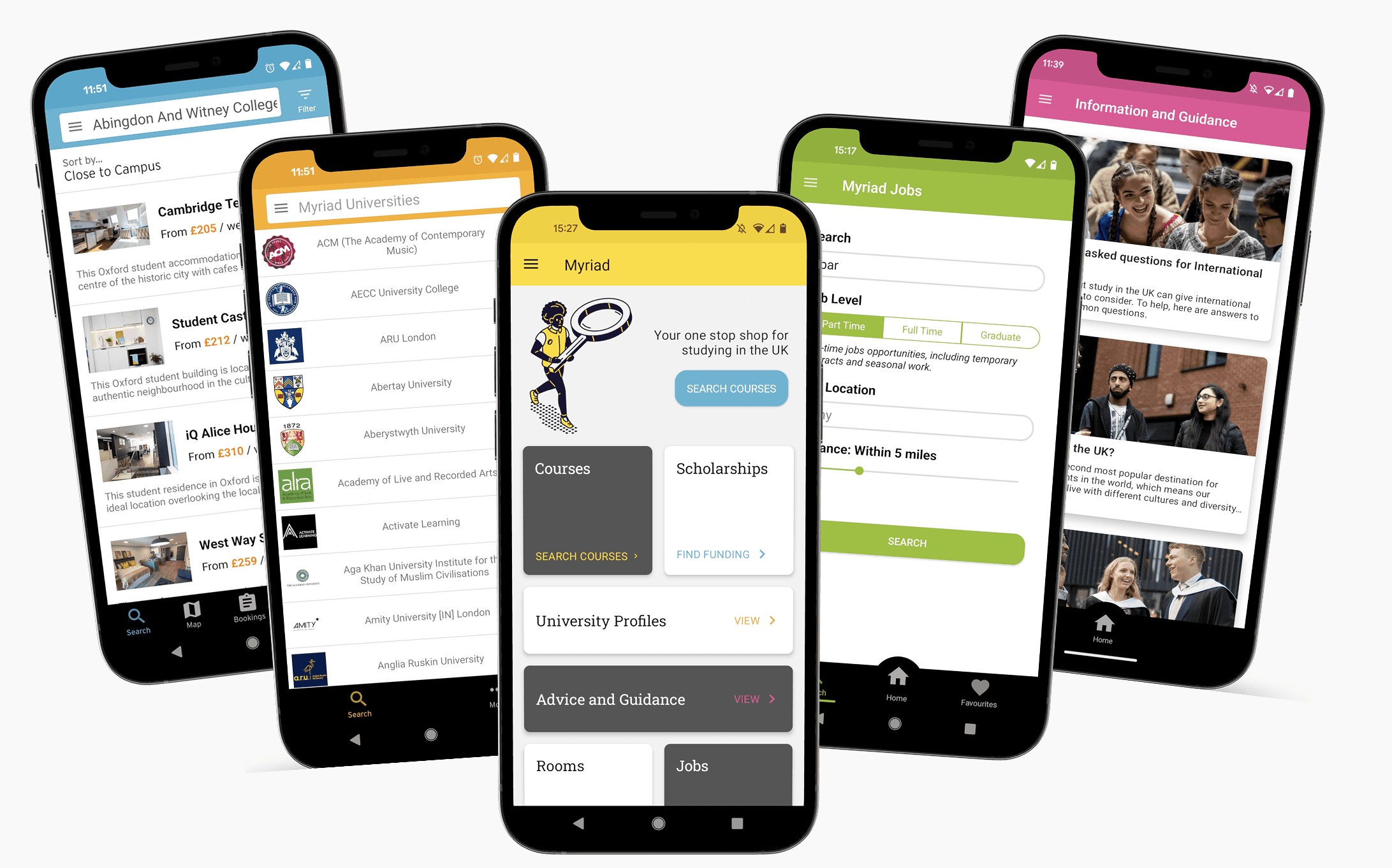
Bringing the vision to life.

With less than a month to update all 3 international products, I worked quickly in collaboration with developers to apply and integrate the new aesthetic, prioritising the app first.


The updated designs were well received internally, and sales and marketing teams were enthusiastic to show off the refreshed product suite.

“With learners, we want to start by exciting them about the possibilities a truly impartial and fair platform can create – and the wealth of opportunity, choice and confidence they gain when signing up”

“With learners, we want to start by exciting them about the possibilities a truly impartial and fair platform can create – and the wealth of opportunity, choice and confidence they gain when signing up”

“With learners, we want to start by exciting them about the possibilities a truly impartial and fair platform can create – and the wealth of opportunity, choice and confidence they gain when signing up”

Designing for Conversion from the First Screen.

With a well-defined visual direction, our collaboration with Hybrid shifted towards the articulation of the value proposition and brand messaging. Starting with a targeted approach for learners, we focused on the following key themes:


  1. Conciseness: Messages should be brief, clear, and instructional.

  2. Aspirational Tone: Elevate messaging to resonate with learners’ dreams and aspirations.

  3. Transparency: Emphasise UCAS’s commitment to transparency, reinforcing its position as a trusted brand.


To effectively convey these messages, I worked with the marketing team to find opportunities to integrate and emphasise them within the product. One easy target I immediately identified was onboarding screens, recognising that the first screen a student sees after download was the highest-leverage moment to convert aspiration into action.

Designing these screens, I focused on incorporating the messages that guided students from aspirational ‘Find your dream’ sentiments to a more detailed feature exploration, culminating in conversion-oriented calls to action.

Leveraging the luggage tag image containers on screens 1 and 3, I wanted to build a first impression that quickly and visually associated students with travel. On Screen 2, I introduced the new illustration style to add a bit of variety and intrigue.

The recommended bold, uppercase font served well to maximise the impact of the lead messages, I used Roboto for the supporting content as this was more accessible at smaller sizes.


Stakeholders loved the designs and felt the flow captured the intended tone of voice well.

Measure

Measure

Measure

Exponential Growth.

In December 2023, the revamped app was successfully released on schedule. Stakeholders were pleased the new aesthetics achieved the intended goals of aligning better with the UCAS brand, whilst being attractive and engaging to the intended audience. However, the proof of the rebranding success would be in the numbers.

12 weeks after the rebranded product launch, I examined the available data;

+428% increase in App and Play store conversions

Myriad design: 8000

New design: 46,580

+326% increase in sign ups after download

Myriad design: 7399

New design: 31,561

+294% increase in daily active users

Myriad design: avg. 79 p/day

New design: avg. 311 p/day

+428% increase in App and Play store conversions

Myriad design: 8000

New design: 46,580

+428% increase in App and Play store conversions

Myriad design: 8000

New design: 46,580

+326% increase in sign ups after download

Myriad design: 7399

New design: 31,561

+326% increase in sign ups after download

Myriad design: 7399

New design: 31,561

+294% increase in daily active users

Myriad design: avg. 79 p/day

New design: avg. 311 p/day

+294% increase in daily active users

Myriad design: avg. 79 p/day

New design: avg. 311 p/day

Increased visits to the Play and App stores and continued steady download figures signified that the updated branding and refined value proposition resonated with international audiences, which was promising.


Furthermore, the substantial increase in conversion rates in both the App and Play Stores, and over 300% surge in sign-ups post-rebrand, validated the impact of the revamped onboarding screens and associated messaging. Indicating that these screens were successful in converting users and encouraging action.


Further testament to the project’s success was seen in the increase in user activity, and a consistent rise in daily active users was sustained consistently in the months following the initial release, averaging 311 active users per day. This increase remained significant when accounting for the larger user base, so even without any product functionality or feature changes, the new aesthetic appeared to be better at engaging and sustaining user interest.

Success sustained

Success sustained

Define

Business Impact.


Beyond excellent initial results, the rebrand demonstrated long-term value returns, for example;


  • Mainstreaming the International Journey: The rebrand elevated international admissions from a side project to a core UCAS strategic pillar. With international undergraduate applications up 0.7% (115,730 applicants) by January 2024, the rebrand positioned the business to capitalise on the projected 60% rise in global demand by 2030 and paved the way for brand and experience parity for international students.

  • Unlocking Emerging Markets: In markets where students are particularly sensitive to platform credibility, the UCAS International rebrand acted as a trust accelerator in the following months. Nepal saw 92% growth in student numbers (2024/25) and Pakistan emerged as a top ten market with a 59% increase in demand suggesting the brand credibility of UCAS International was instrumental in converting interest into formal applications and displacing reliance on unverified third-party agents.


Learnings.


Operating at pace across a complex, multi-audience rebrand pushed me to develop in two significant ways:

  • Bridging Brand, Product and People: Working with Hybrid was my first experience leading product strategy around an externally developed creative concept — meaning I had to hold the line between brand fidelity and product reality without owning the creative itself. That required a different kind of influence: building enough shared understanding across product, sales, marketing and the agency that every decision felt collectively owned, even when I was the one making the call.

  • The Value of Foundations: Despite delivery across three products within a 30-day implementation window, the rebrand rollout was significantly accelerated by a pattern library I had previously introduced. Seeing that investment pay dividends under real delivery pressure reinforced my belief that design systems aren't an overhead, they're a strategic asset that compounds in value over time.

Learnings.


Operating at pace across a complex, multi-audience rebrand pushed me to develop in two significant ways:

  • Bridging Brand, Product and People: Working with Hybrid was my first experience integrating an externally developed creative concept, requiring me to balance creative fidelity with product implementation realities. With distinct audiences and stakeholders across product, sales and marketing, the project demanded careful cross-functional alignment and the ability to translate brand decisions into language that resonated differently depending on who was in the room.

  • The Value of Foundations: Despite delivery across three products within a 30-day implementation window, the rebrand rollout was significantly accelerated by a pattern library I had previously introduced. Seeing that investment pay dividends under real delivery pressure reinforced my belief that design systems aren't an overhead, they're a strategic asset that compounds in value over time.


Learnings.


Operating at pace across a complex, multi-audience rebrand pushed me to develop in two significant ways:

  • Bridging Brand, Product and People: Working with Hybrid was my first experience leading product strategy around an externally developed creative concept — meaning I had to hold the line between brand fidelity and product reality without owning the creative itself. That required a different kind of influence: building enough shared understanding across product, sales, marketing and the agency that every decision felt collectively owned, even when I was the one making the call.

  • The Value of Foundations: Despite delivery across three products within a 30-day implementation window, the rebrand rollout was significantly accelerated by a pattern library I had previously introduced. Seeing that investment pay dividends under real delivery pressure reinforced my belief that design systems aren't an overhead, they're a strategic asset that compounds in value over time.

Jo Laycy 2026 ©

Jo Laycy 2026 ©

Jo Laycy 2026 ©

Back to top