Reducing Onboarding by 7 Days via Dashboard Clarity


Senior UX Designer
Fruugo: global marketplace connecting 7M shoppers to 4000+ retailers in 40 countries.
7 days reduction in avg. onboarding
12x decreased search volume per retailer
71% Increase in user satisfaction
Research
Back-stage Vs front-stage.
The Product Owner (PO) and I mapped the end-to-end onboarding journey, detailing the jobs to be done (JTBD) for both retailers and internal teams, and it quickly became apparent we could not improve the retailer experience without first fixing the internal operational engine. Lacking historical quantitative data, I led a "backstage-first" research phase, conducting workshops with the internal Tech Ops team in which the following themes kept emerging:
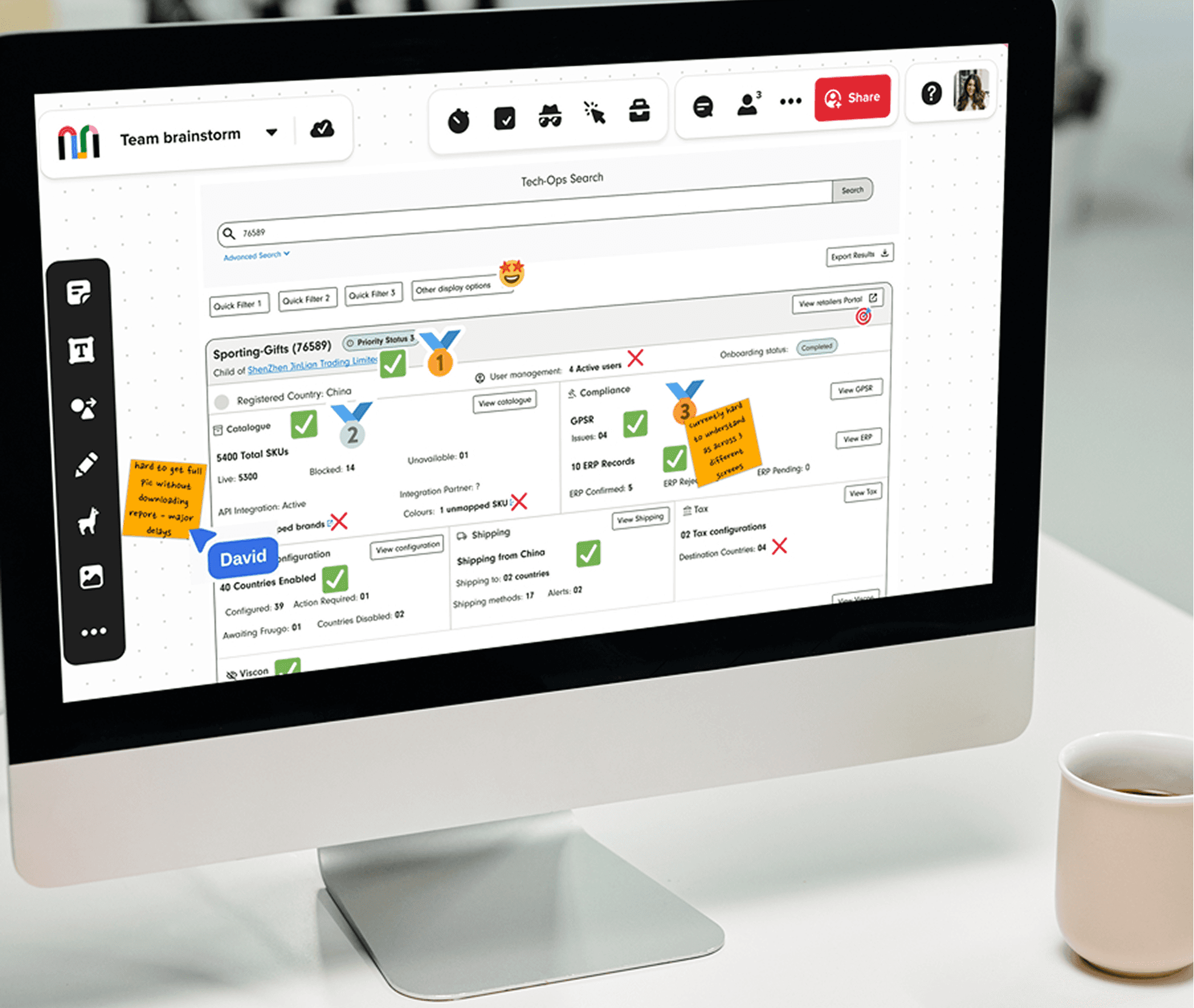
Fragmented Architecture : Excessive design debt in the Tech Ops tool (which handled the majority of retailer onboarding) forced a disjointed workflow. Onboarding a single retailer required a minimum of 12 separate searches across inconsistent interfaces, leading to wasted time and navigation fatigue.
Low-Value Manual Retrieval: 13 of the 31 onboarding tasks were identified as simple data validation or fetches. Users were forced to navigate multiple pages, then tab-juggle to manually copy data into third-party systems or UIs, creating a high risk for human error.
Information Silos & Visibility Gaps: Data was hidden within specific modules, making cross-team collaboration impossible. Sales and Account Management teams lacked visibility into retailer progress, forcing them to rely on manual status updates from Tech Ops. This problem was further confounded by the fact internal teams lacked a clear understanding of the retailer-facing interface, creating a disconnect between the support they provided and the actual user experience in the retailer tool.


Beyond the obvious time loss and performance inefficiencies of repeated queries, the above friction had also accidentally contributed to a culture of mistrust. Users felt that previous features and attempts to improve their workflows had been delivered with little context or collaboration, inadvertently increasing the complexity of the Tech Ops tools rather than reducing it.
This was important context to shape our approach moving forward, and the PO and I were keen to continue in a collaborative method to ensure designs were firmly rooted in the users' day-to-day realities.

Our current process is hindered by the [Tech Ops] tool…we spend too much time on things the technology should be doing…or at least helping us with…and less time on actually doing the important, core tasks that humans should be doing
One Search to Replace Twelve.
With a clearer understanding of the operational barriers and commercial consequences of inaction (increased operational costs, delayed revenue, and reputational risk) the Product Owner (PO) and I explored multiple solutions with stakeholders, including AI-driven task automation and a centralised notification hub.
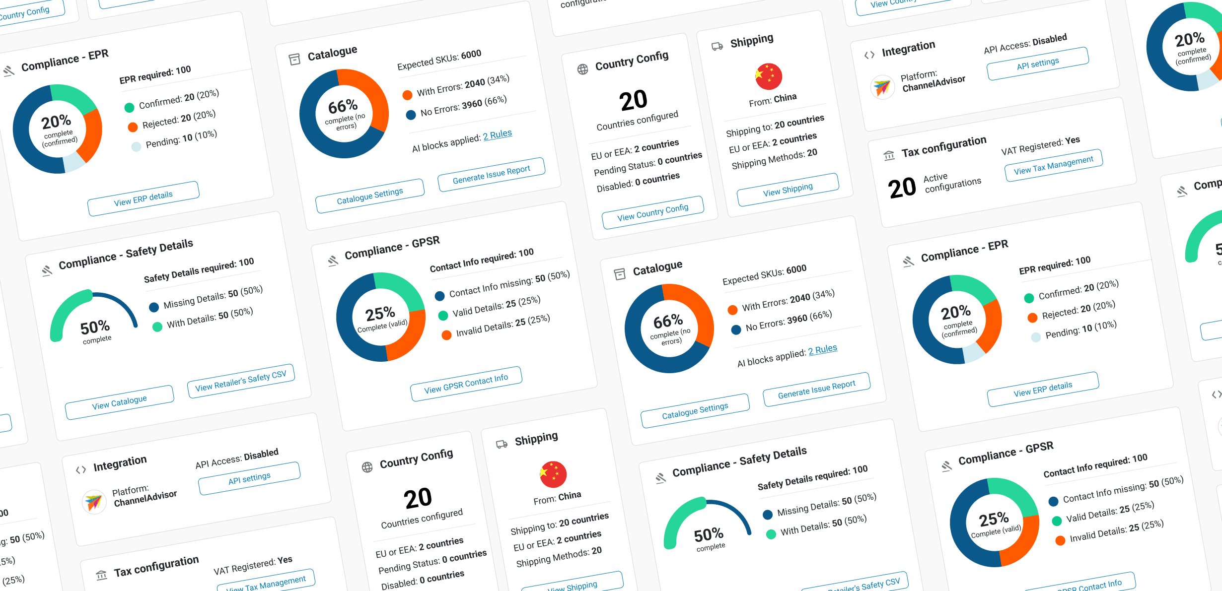
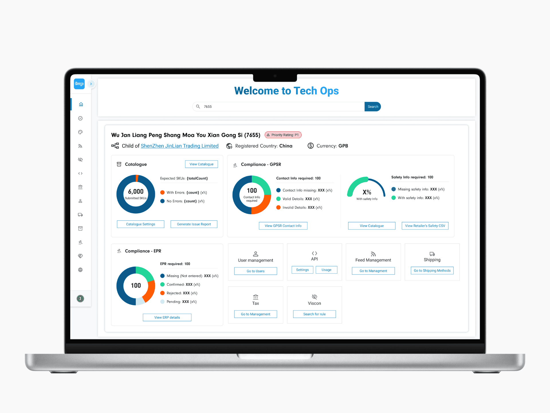
The strongest solution to emerge was a single global search replacing the existing 12 separate module searches, with a holistic results dashboard consolidating the most useful data from all 12 modules into a single, unified UI. While this didn't eliminate all manual data fetching tasks, it significantly reduced the navigation required to find data and laid the foundation for automating those tasks later.
01.
Decrease search volume per retailer
Users should be able to access all required functionality to onboard a retailer in less than 1-2 search queries
02.
Increase critical data find-ability
Users should be able to find all core data points in 10 seconds or less
03.
Increase user satisfaction
At least 70% of users should report improved satisfaction with the tool
Defining Value and Trade-offs.
With high enthusiasm from Tech Ops, we ran a collaborative prioritisation exercise to identify the most critical data points for meaningful search results. From potentially hundreds of data points across 12 modules, users distilled these to 23 essential attributes, ranking them by usefulness and discussing presentation to ensure clarity without overwhelming the interface.
More ambitious features, such as filters and tooltip visualisations, were deliberately deferred in favour of a focused MVP: a fully functional dashboard surfacing this critical data. Catalogue and Compliance cards formed the foundation, with remaining cards delivered sprint by sprint until the complete vision was realised


Card by Card, Sprint by Sprint.
Due to the complexity of the data required for meaningful search results, I quickly established a card-based layout to ensure a clear visual hierarchy as I developed designs. This approach enabled a "card-by-card" design process where I designed, tested, and validated a card in one sprint, before it was developed and released in the next. This approach facilitated continuous user and engineering collaboration, and ensured the consistent delivery of value throughout the quarter, avoiding the risks of a 'big-bang' release at the end.
The first sprint delivered a core global search feature and the basis for the new holistic search results. In this initial release, we were able to include the first fully developed results card - the catalogue card, as well as 11 quick access buttons to the remaining Tech Ops modules.


Measure
'It definitely makes monitoring progress much easier…'
After deploying the global search in Q1, we evaluated the results in Q2 once the new workflow had embedded. Since user analytics were still unavailable, a questionnaire felt like the most proactive, accessible way to capture insight.
Search volume was the most immediate win. The single global search reduced queries per retailer from 12 to 1, saving users a minimum of 48 clicks per onboarding. 79% of users confirmed they saved moderate to significant time each week — time they could now direct toward higher-value onboarding tasks rather than manual data retrieval. 93% agreed it was easier to access core functions than before.
Data find-ability exceeded our expectations entirely. The dashboard now surfaced all 23 required data points in under 2 seconds — well inside our 10-second target. Every single user confirmed that the holistic view improved task prioritisation and made it easier to spot data gaps that had previously stalled onboarding. The benefits also extended cross-functionally: Account Managers reported a significant reduction in their dependency on Tech Ops for status updates, a ripple effect we hadn't explicitly designed for but were glad to see.
User satisfaction told the most meaningful story. 71% of Tech Ops users reported being significantly more satisfied with the tool — clearing our 70% target and, more importantly, signalling that we'd begun to rebuild the culture of trust that had eroded over years of top-down delivery.
It definitely makes monitoring progress much easier, and saves a lot of time….Overall, it's a lot quicker if I need to check a retailer's live data. I can see what's missing right away on the [search results] dashboard.


