

Accelerating retailer onboarding by streamling workflows
Accelerating retailer onboarding by streamling workflows
Accelerating retailer onboarding by streamling workflows
UX Research
UX Design
Web UI
Ecommerce
Context
In 2024, I joined Fruugo on a maternity cover contract during a pivotal time when the business was focused on growing its platform and attracting high-quality retailers. By early 2025, the priority was focused on 'onboarding retailers at pace'.
Together with the Product Owners, I was tasked with identifying and improving internal tools and workflows to streamline the onboarding process. Our goal was to reduce inefficiencies and minimise manual tasks for the internal teams, whilst creating opportunities for retailers onboarding to self-serve as much as possible.
Challenges
The primary tool used for onboarding retailers, the 'Tech Ops' tool, was designed as an internal-facing system. Over time, it had accumulated significant technical and design debt. This made it challenging to navigate and optimise, as there were numerous potential pain points to address.
In addition, due to the users being Fruugo staff there was little quantitative or interaction data available from the tool, so we relied heavily on anecdotal evidence from team members to understand the user experience. Their feedback revealed a range of "workarounds" that had evolved to cope with the tool’s design flaws, which contributed to a lot of inconsistencies and inefficiencies, as different team members developed their own methods for navigating the tool, leading to a lack of uniformity in how it was used and learned.
Process
Research
Research
Prioritise
Prioritise
Define
Define
Test & Iterate
Test & Iterate
Design
Design
Measure
Measure
Results (Data collection in Progress)
XX decrease in time to access core functions
From: X - To: Y
XX decrease in searches conducted to access information
From: X - To: Y
Increase in user satisfaction using Tech Ops tool for onboarding
From: X - To: Y
Process
Research
Prioritise
Define
Test & Iterate
Design
Measure
Results (Data collection in Progress)
XX decrease in time to access core functions
From: X - To: Y
XX decrease in searches conducted to access infromation
From: X - To: Y
XX decrease in time spent communicating status updates across teams
From: X - To: Y

Research
Research
Research
'Designed for, not with'…
The product team and I began our research by interviewing three team leaders whose teams were responsible for onboarding retailers. Our goal was to gain a deeper understanding of the user experience and the challenges they faced in their workflows.
Interview and Observation Insights:
Painful Navigation: The design of the Tech-ops tool separated core onboarding functions into 12 distinct modules; the implementation required users to search for a retailer every time they entered a module to access any action within the module. This not only delayed access to basic functionality, but also put unnecessary strain on system performance due to frequent search queries.
Fragmented Information: The siloed design of the tool made it difficult for team members to view a retailer’s full onboarding progress. Users were forced to juggle multiple tabs and windows across different modules, leading to difficulties in "picking up where they left off." This disjointed view also hindered collaboration with other teams, such as Sales and Account Managers, who struggled to offer support without a unified view of progress. Consequently, much time and effort was spent sharing status updates and coordinating progress across teams.
Inconsistent Automation: While some onboarding tasks were automated in certain parts of the tool, automation was applied inconsistently and sporadically. As a result, many tasks still relied heavily on manual work, which increased the risk of human error thus led to more review cycles, further adding to the team's workload.
Frustration with Tool Development: Users also expressed some frustration over the evolution of the tool. They noted that, over the years, they had not been actively involved in its design and felt disconnected from decisions that often directly impacted their workflow. This meant they often had to adapt to new features that were built for them, rather than with their input.
- Painful Navigation: The design of the Tech-ops tool separated core onboarding functions into 12 distinct modules; the implementation required users to search for a retailer every time they entered a module to access any action within the module. This not only delayed access to basic functionality, but also put unnecessary strain on system performance due to frequent search queries.
- Fragmented Information: The siloed design of the tool made it difficult for team members to view a retailer’s full onboarding progress. Users were forced to juggle multiple tabs and windows across different modules, leading to difficulties in "picking up where they left off." This disjointed view also hindered collaboration with other teams, such as Sales and Account Managers, who struggled to offer support without a unified view of progress. Consequently, much time and effort was spent sharing status updates and coordinating progress across teams.
- Inconsistent Automation: While some onboarding tasks were automated in certain parts of the tool, automation was applied inconsistently and sporadically. As a result, many tasks still relied heavily on manual work, which increased the risk of human error thus led to more review cycles, further adding to the team's workload.
- Frustration with Tool Development: Users also expressed some frustration over the evolution of the tool. They noted that, over the years, they had not been actively involved in its design and felt disconnected from decisions that often directly impacted their workflow. This meant they often had to adapt to new features that were built for them, rather than with their input.

Our current process is hindered by the [Tech Ops] tool…we spend too much time on things the technology should be doing…or at least helping us with…and less time on actually doing the important, core tasks that humans should be doing
Our current process is hindered by the [Tech Ops] tool…we spend too much time on things the technology should be doing…or at least helping us with…and less time on actually doing the important, core tasks that humans should be doing
Time-consuming and Expensive...
Leveraging the understanding gained from initial interviews, we then engaged team leads in detailed workshops to map the end-to-end workflow to onboard a new retailer onto the Fruugo marketplace. This process helped illuminate the most significant pain points and understand the magnitude of these issues, where user behaviour data was lacking.
31 tasks in total onboard a new retailer
18/31 tasks completed within specific modules of the 'Tech Ops' tool.
31 tasks in total onboard a new retailer
18/31 tasks completed within specific modules of the 'Tech Ops' tool.
12 modules housing specific functionality
Each module accessible by module search > search results > module functionality.
12 modules housing specific functionality
Each module accessible by module search > search results > module functionality.
Minimum of 15 searches required to complete 18 tasks
Each search and results pages with inconsistent design
Minimum of 15 searches required to complete 18 tasks
Each search and results pages with inconsistent design
31 tasks in total onboard a new retailer
18/31 tasks completed within specific modules of the 'Tech Ops' tool.
12 modules housing specific functionality
Each module accessible by module search > search results > module functionality.
Minimum of 15 searches required to complete 18 tasks
Each search and results pages with inconsistent design
Images coming soon
5 task status updates automated
For some tasks, when moving into a different state an automated slack update was triggered.
5 task status updates automated
For some tasks, when moving into a different state an automated slack update was triggered.
7 task status updates required manual comunication
Other tasks required manual communication across multiple channels, i.e. slack and email
7 task status updates required manual comunication
Other tasks required manual communication across multiple channels, i.e. slack and email
5 task status updates automated
For some tasks, when moving into a different state an automated slack update was triggered.
7 task status updates required manual comunication
Other tasks required manual communication across multiple channels, i.e. slack and email
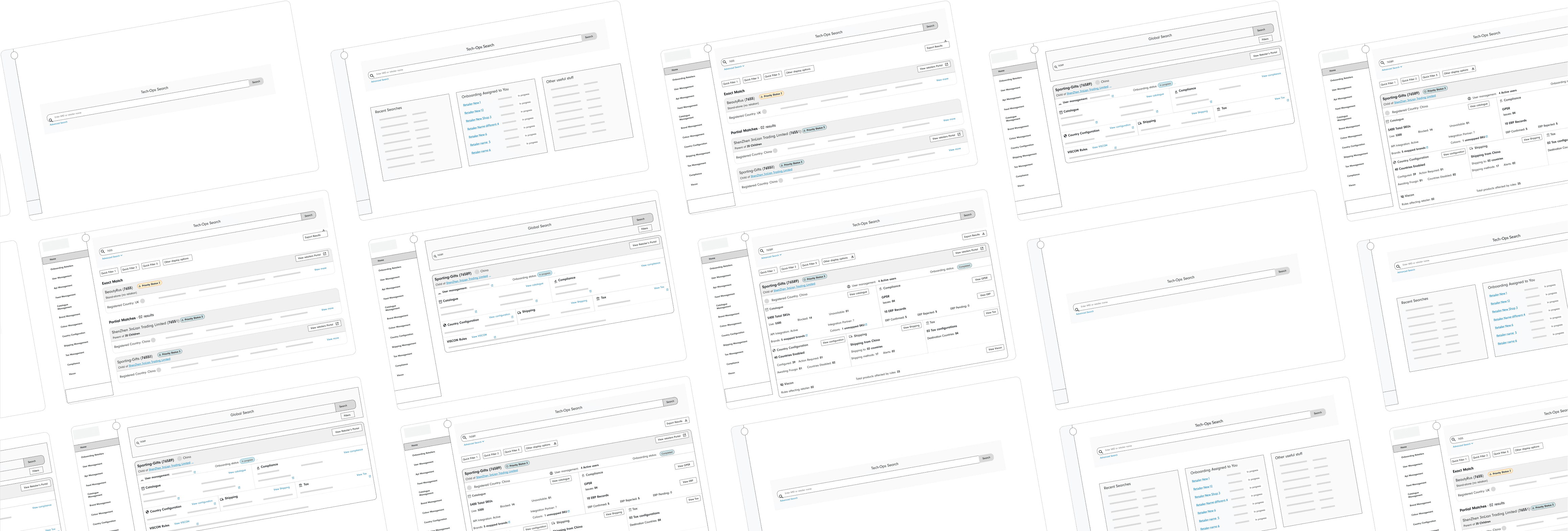
Exploring a new approach.
Collaborating with developers and users, the Product Owner (PO) and I iterated a promising solution: a single, global search to replace the Tech Ops tool's twelve separate module searches. Centralising relevant information into consistent, unified search results, the concept aimed to dramatically reduce manual navigation and searching for basic onboarding data whilst streamlining inter-team progress updates.
High-level wireframes were created to test this vision with internal stakeholders for early feedback and validation.

Prioritise
Prioritise
Prioiritising
Defining Value.
With stakeholders embracing the global search concept, the PO and I held a user workshop to pinpoint their top data priorities for search results. This aimed to streamline the 18 out of 31 onboarding tasks that currently require navigating to specific modules solely to verify data existence.
The insights gleaned from the prioritisation exercise informed the design scope of the search results and helped us consider the development approach needed to deliver this work efficiently.
Define
Measuring success.
Aligning with the wider business goal of accelerating retailer 'onboarding at pace', and focusing on the most critical pain points uncovered in our research, we defined the following two measures to determine the success of this project in improving the user experience.
These two measures of success focused on the most significant drains on time and resources within the existing onboarding process, which seemed like the most valuable places to start.
01.
Decrease time spent to access core onbaording functions
Reduce number of clicks or page loads
02.
Decrease searches required to access information
Reduce number of clicks or page loads
03.
Reduce time spent on manual status updates across teams
20% decrease in hours spent creating and sending manual status updates per week.
Define
Define
Measuring success.
Aligning with the wider business goal of accelerating retailer 'onboarding at pace', and focusing on the most critical pain points uncovered in our research, we defined the following two measures to determine the success of this project in improving the user experience.
These 3 measures of success focused on the most significant drains on time and resources within the existing onboarding process, which seemed like the most valuable places to start.
01.
Decrease time spent to access core onbaording functions
Users should be able to access core functionality in 2 clicks or less
02.
Decrease searches required to access information
Users should be save moderate to significant time on searching for information
03.
Increased satisfaction with Tech Ops tool
to complete onboarding tasks
Design
Design
Real-Time Insights
Fast and iterative.
To deliver the new global search and search results efficiently, we adopted a card-by-card design process. This allowed focused design, validation and refinement of each card before development, ensuring a fluid, continuous delivery of value throughout the quarter, rather than a large upfront release.
The first sprint delivered a core global search feature, significantly reducing navigation by integrating quick-access buttons to all 12 Tech Ops modules directly within the search results. This eliminated the time-consuming need for users to enter each module individually and perform redundant searches to access core functionalities.

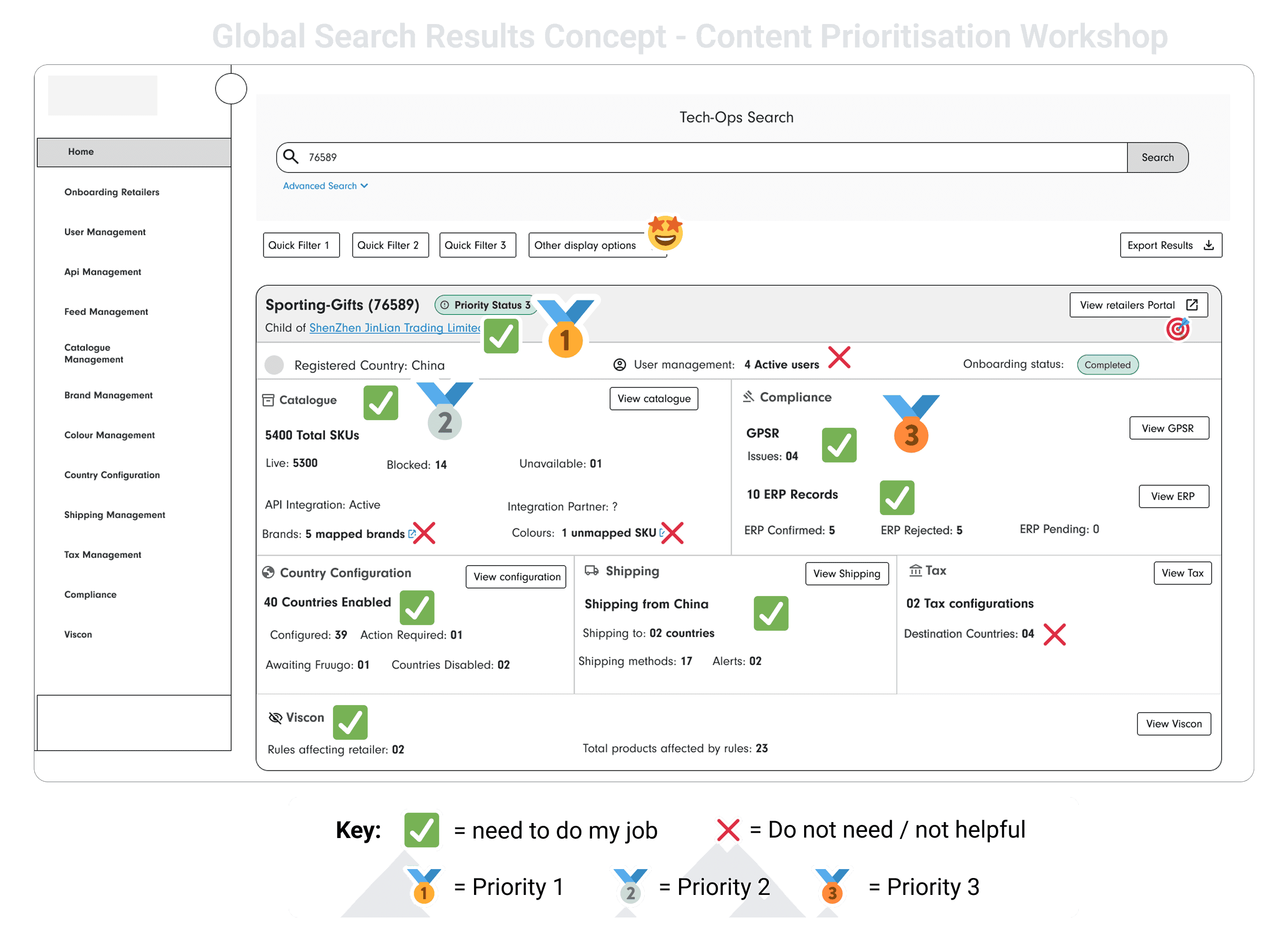
Simultaneously, we addressed the inaccessibility of catalogue information by implementing the "Catalogue Card" in the global search results.
This card provided an at-a-glance view of crucial SKU data: expected, uploaded with errors, and successfully uploaded. This design directly solved a significant user pain point, condensing a four-step navigation process (Catalogue Module > Search > Search Results > Retailer's Catalogue View) into a single, efficient display. Furthermore, the addition of the ' with errors' metric automated a previous manual check, offering an immediate indicator of a retailer's 'go live' status.
Whilst the engineering development of the above work was in progress, I focused on designs for readily available legal and compliance data. This phase involved several design iterations, driven by Tech Ops feedback, culminating in three distinct and informative cards.
As with the above Catalogue Card, these cards surfaced crucial Retailer data in the global search results instead of being separated across multiple screens.
In the following weeks, our design process remained deeply collaborative, with continuous engagement from Tech Ops users shaping the development of subsequent cards for shipping, country configuration, tax management, and integration information.

Critically, the iterative process addressed both individual card functionalities and the broader search results experience. We continuously refined the overarching layout and information architecture, aiming for a cohesive and intuitive design where the placement and organisation of all cards directly mirrored Tech Ops' established workflows and information retrieval patterns.
In each sprint we successfully delivered a new card, and by the end of quater 2 we had succsefully implemented all agreed modeule cards.
Measure
Measure
Measure
Feedback so far…
Our iterative design and agile development process culminated in the successful, on-time delivery of the full Tech Ops global search and search results dashboard in quarter 2.
The Tech Ops users are currently providing feedback, and the response to the integrated global search and dashboard design so far has been overwhelmingly positive. Users are highlighting its intuitiveness and significant time savings, and initial data taken from a self-report survey is highlighted below.
As we gather additional user data to verify our measures of success over the next quarter, I will update this case study accordingly.
Our iterative design and agile development process culminated in the successful, on-time delivery of the full Tech Ops global search and search results dashboard in quarter 2.
The Tech Ops users are currently providing feedback, and the initial response to the integrated global search and comprehensive card-based design has been overwhelmingly positive. Users are highlighting its intuitiveness and significant time savings, and over the next quarter, we will be closely reviewing our key measures of success to quantify the impact of these design changes.
In the meantime, this promising start has spurred exploration into extending similar benefits to our retailers. We are now in the initial stages of envisioning a self-serve onboarding portal, aiming to empower them to do as much as possible of the 'go live' journey themselves, applying the successful principles and anticipated learnings from the Tech Ops dashboard implementation.
93% report the dashboard has made it easier to access core functions
with 11 functions now accessible from 1 click from the results dashboard
79% report moderate -significant time saved (per week) on searching
79% report moderate -significant time saved (per week) on searching
compared to previously conducting a search per module
100% report the dashboard helps them get a better holistic view of a Retailer's onboarding status
100% report the dashboard helps them get a better holistic view of a Retailer's onboarding status
Reducing the need for time consuming, manual cross team status updates
XX time to access core functions
to complete onbaording tasks
Decrease from XX mins in original designs
XX avg. searches conducted
to onbaord an individual retailer
From avg. of XX per retailer in original designs
XX time saved on status updates
for manual status updated
From XX mins in original design

71% report being significantly more satisfied with the Tech Ops tool
compared to before the introduction of this work
57% report it being easier to make prioritisation decisions about work
with the data from the dashboard
XX time to access core functions
to complete onbaording tasks
Decrease from XX mins in original designs
XX avg. searches conducted
to onbaord an individual retailer
From avg. of XX per retailer in original designs
XX time saved on status updates
for manual status updated
From XX mins in original design
It definitely makes monitoring progress much easier, and saves a lot of time….Overall, it's a lot quicker if I need to check a Reatiler's live data. I can see what's missing right away on the dashbaord.
It definitely makes monitoring progress much easier, and saves a lot of time….Overall, it's a lot quicker if I need to check a Reatiler's live data. I can see what's missing right away on the dashbaord.

Next steps.
Gathering ongoing feedback from the Tech Ops team and diligently collecting data to rigorously evaluate the success of the newly implemented dashboard against our defined metrics.
Discovery phase to explore a Retailer Self-Serve Concept. building upon the success and learnings from the Tech Ops dashboard, to investigate if a similar search-driven experience could help retailers navigate the onboarding process more efficiently and independently, leveraging data visualisations to guide and encourage task completion